Illustration Open Challenge 1 & 2
- Ayu Whitmore

- Nov 17, 2025
- 6 min read
Updated: May 19
The prompts for the first (21/11/25) Illustration Open Challenge are as followed:
Where lost thoughts go
Before it disappeared
Something that remembers you
THE DATA CEMETERY
A popular theory that has circulated online since around 2019 on fringe discussion boards before getting mainstream attention states the internet has "died" as a result of the domination of AI-generated content and automated bots. There is an endless churn of "engagement bait"- posts engineered purely to farm likes and reposts. Rehashed internet-exclusive jargon, Midjourney memes, copypastas; they cycle through feeds until they become a kind of cultural exhaust. Amusing at first, but quickly devolving into "brainrot": the hollow type of post encountered dozens of times in a single session of doomscrolling.
Older forms of online expression such as blogging, traditional web forums, and online chat rooms have largely fallen out of fashion, supplanted by modern social media platforms and instant messaging services, many boards for niche and general communities now defunct. What remains is a narrowing tunnel constantly absorbing meaningless data, posts swallowed by the information highway, with only the most infamous or crude artifacts staying afloat.
The theme aligns with my Amplify project exploring online extremism. Entering this competition offered an opportunity to advance both efforts at once; navigating the organisation of an additional project while responding innovatively to the vague prompts of this challenge, both furthering my ongoing research into the mechanisms of the internet.
Informed by the research I had done previously of David Dees' work, I depicted several of the more absurd trending topics currently cycling through Twitter, focusing primarily on the American sphere (which always seems to outdo itself).

Sydney Sweeney assumes the role of Giovanni Battista Salvi da Sassoferrato's depiction of the Virgin Mary, cradling Pepe the Frog as infant Jesus, a commentary inspired by nationalist 'groypers' rallying behind her blasé response to allegations of white-supremacy-sympathising, enshrining her as a dissident right icon.
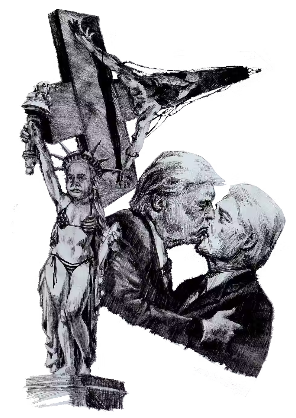

Donald Trump and Bill Clinton share a kiss, a visual riff on the outlandish speculation by shitposters following the resurfacing of an incriminating email in the aftermath of the Epstein files release. It’s an insight into how online gossip culture distorts reality and turns politics into memeable theatre.
Benjamin Netanyahu stands as an indecent Statue of Liberty, a nod to a phrase I frequently encounter online: "The United States of Israel", used both to criticise U.S.-Israel relations and, at times, to invoke long-standing antisemitic conspiracies, the so-called "JQ", an abbreviation of "Jewish Question" (taken from the Nazi regime's use of the term "Final Solution to the Jewish Question" in reference to the Holocaust).
I also reinterpreted Dalí's Christ of Saint John of the Cross, attaching wires to his body, cascading down the cross; a visual metaphor for how the internet fulfils roles once occupied by religion.
The Outcome

I didn't have as much time as I would've liked, the week of 17th November was packed - peer review on Monday, an oral formative for ILLU20001: Contemporary Issues on Tuesday, and another oral for my optional module on Wednesday. Due to all the preparation I was doing prior, I only had three days spare during the week to finalise a submission for the 11:59 pm deadline on the 21st.
I'm quite pleased with the final composition. Working with the perspective tool to warp edited, painted-over, and posterized images made the tunnel effect translatable. The descending text definitely aids in readability, guiding the viewer into the darkness beneath. Each word or phrase carries its own relevance: "@grok is this true" being a common phrase I see on X (formerly Twitter), where people outsource basic fact-checking to AI rather than searching themselves (and subsequently getting blasted by anti-AI neo-Luddites), while "vaxxed?" references the ironic catchphrase inspired by conspiracy theorists questioning someone’s vaccination status whenever news of an unrelated illness or death emerges.
The void I interpreted as a simple black square - an empty space where issues of real significance are pulled down and forgotten, archived beneath waves of triviality. In contrast, Dalí's Christ of Saint John of the Cross stands as the focal point, rendered in bright white and seemingly suspended within the chamber, resisting the pull of the surrounding chaos.
The piece doesn't have the same incoherence of Dees' political collages, but I feel I utilised blending modes well to create a distinctly digital feel. Even the moiré pattern I sourced from texturelabs.org, set on exclusion mode, contributed to the overall aesthetic in a way that is thematically fitting.
One thing I do regret not doing is creating a dithering effect around the voided space. Following the perspective of the tunnel, it could appear to eat away at the data descending inescapably.
Despite the time constraints, this project was a lot of fun. Experimenting with the integration of digital and analogue techniques through processing scans imparted some of the sketches with a crisp, pixelated texture that harmonised well with the online theme, a happy accident I intend to replicate for other work in my Amplify project. The time crunch made the process intense, and I challenged myself in pushing away my perfectionism; in a way, the intensity fuelled creativity and compromise in ways a relaxed schedule never could.
The Results
Two winners were selected from third year, two from second year, and one from first year. I was fortunate to be among them, winning the “Best Concept” category, apparently by a large margin. The recognition came as a surprise, there were many inventive submissions both conceptually and medium-wise. The experience has taught me to trust my instincts and have more confidence, while the work of others has encouraged me to push for more imaginative and unconventional approaches in future projects.
I did make the mistake of sleeping through the awards (I should not have taken that nap), next time I'll make more of an effort to show up not just in case of the chance to win but to support my peers and appreciate what we’ve created together as a community.
The prompts for the second (24/04/26) Illustration Open Challenge are as followed:
A Door That Should Never Be Opened
A Beautiful Mistake
A Message From Somewhere Else
BEFORE IT SETS
Out of concern for the lack of spontaneous work I had done for the constant Everyday Radical project, I decided to create a piece that feels domestic, grounded in an everyday reality I'm familiar with, and linked to the Daoist philosophy of wu wei (無為), "non-doing". You can read more about my thought process on my Everyday Radical project section.
I've found that when working digitally, I use too many brushes, stifling my ability by overcomplicating things and making painted pieces look muddy with contrasting textures.
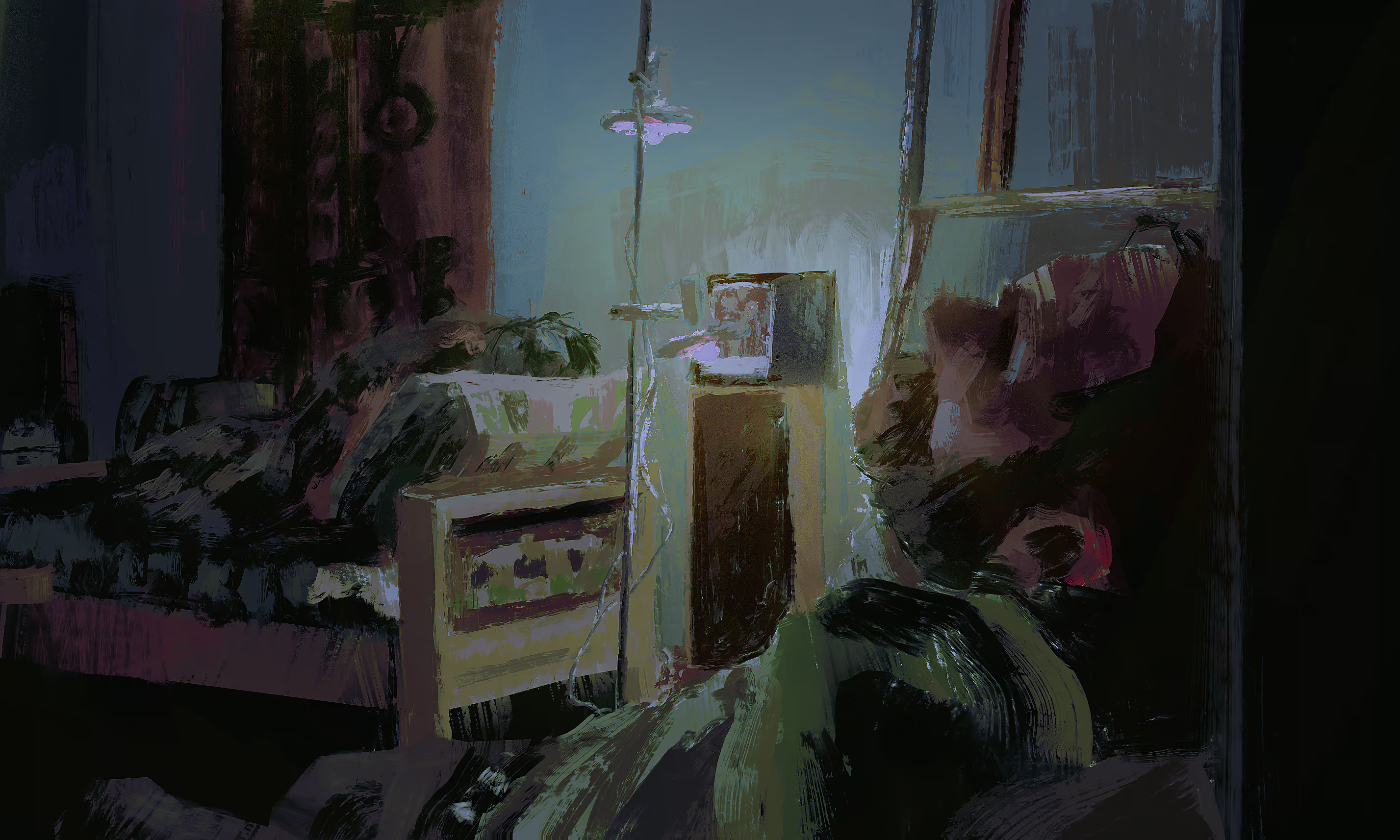
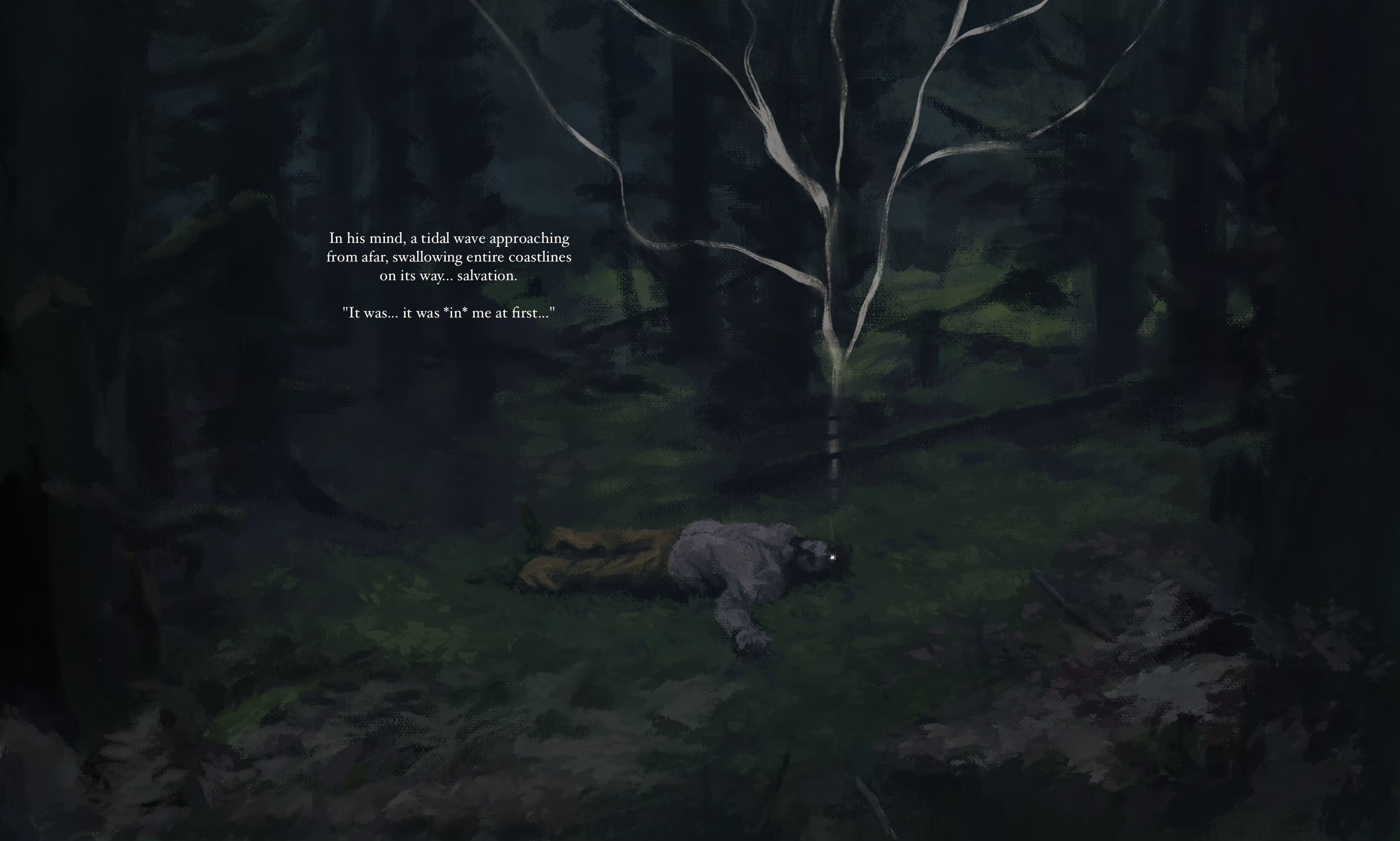
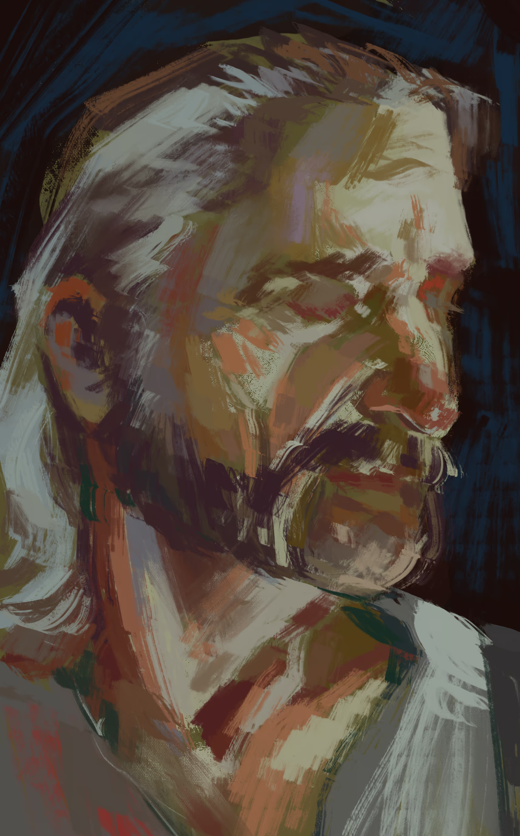
These old pieces from August of 2025 use just one to two brushes each, which aided me in finishing them in half an hour to an hour (a feat, as I normally overwork pieces and spend longer than necessary on them). They ended up more cohesive than digital pieces where I stressed myself out picking and using numerous brushes to accentuate textures.
I limited myself to two brushes for my entry piece. It feels more natural like painting traditionally. I was inspired by the recent Disco Elysium mobile's background art (no support to the corporate people who stole the game from the original creators, but the artists who worked on the art in the mobile version quite successfully emulated Alexander Rostov's distinctly impasto style in places), though I'm definitely lacking in the colour theory and shape language employed in their environmental pieces.
The Outcome

The overall vibe of the piece is quaint and I enjoyed drawing the little details, such as the kids cycling off into the distance and the construction workers enjoying their tea. The focal point of the cat stepping in wet concrete of course represents the "beautiful mistake". It's both playful and befitting of the theme.
I made the perspective subtly incorrect in a way that adds to the piece, the street twists into the distance and it adds a degree of "whimsy". It was inspired by Rob Pointon's urban environmental work, but I wasn't successful in capturing the same trippy distortion effect as him, so I aim to practice learning how to push perspective more in the future. Visually its simple but I am satisfied with it considering it only took a couple hours.
The Results
I won "Best Concept" category again and the overall prize, which was surprising as the other entries were both visually incredible and conceptually clever (also I showed up this time, character development).
Really the best part of the Awards ceremony was the film after, the cult classic Vampires in Havana which I recommend to anyone who enjoys political satires and adult animation.


Comments