60 Years of the Tricontinental Conference
- Ayu Whitmore

- Nov 22, 2025
- 8 min read
Updated: Dec 9, 2025
Our entire people have
lived through a big feast
of international solidarity.
Our people have felt as their
own each and every one of
the problems of other people.
--Fidel Castro
The 3rd of January 2026 marks the 60th anniversary of the Tricontinental Conference in Havana, Cuba. The event brought together more than 500 delegates from over 80 countries and colonies across what was then known as the Third World (now the Global South). Emerging from the momentum of the Cuban Revolution, this conference pioneered a new vision of “Third Worldism,” one that championed anti-colonial struggle.
The conference catalysed the formation of two major organisations in 1967: OLAS (Latin American Solidarity Organization) and OSPAAAL (Organization of Solidarity with the Peoples of Asia, Africa, and Latin America).

In its effort to foster global dialogue, OSPAAAL published Tricontinental, a quarterly magazine distibuted internationally. Each issue contained a fold-out poster featuring clear visual metaphors and bold graphics to inform and rally support for the organization’s anti-capitalist, anti-imperialist, and often explicitly anti-American message around the world.
I was given the opportunity to design postcards to be distibuted at the Tricontinental Conference's 60th Anniversary in Havana. To clarify, this is a pro bono collaboration, not a commissioned project. Our ILLU20001: Contemporary Issues in Illustration lecturer, Isabel Story, whose PhD focuses on Soviet-Cuban relations, facilitated the opportunity, and I was happy to volunteer. The event is led by the Centre for Research on Cuba (CRC) at the University of Nottingham, the only research centre outside the Americas focused exclusively on the study of Cuba. Aspects of its work and expertise are shared here at Trent, and I’m grateful to be benefiting from that crossover.
"Create Two, Three . . . Many Vietnams, That Is the Watchword"
--Ernesto "Che" Guevara
This singular statement encapsulates the ethos of OSPAAAL with striking clarity. Guevara invoked it throughout his writings to stress the necessity of sustaining revolutionary movements worldwide as a means of challenging and destabilising U.S. dominance.
Of the more than 300 posters published by the Tricontinental, roughly 25 incorporated him. The most widely reproduced photograph of the 20th century, Guerrillero Heroico, was originally taken by Cuban photographer Alberto Korda (Alberto Díaz Gutiérrez). Decades later, the image was reinterpreted by Irish artist Jim Fitzpatrick, whose stylised rendition propelled it into global circulation. Through this transformation, Guevara’s likeness evolved into a visual emblem of the Cuban Revolution itself, embodying the movement’s aspirations and becoming one of the most enduring political icons of the modern era.

The Cuba Libre Story
Before beginning to design I was sure to properly educate myself about Cuba. Weeks earlier Isabel had kindly sent me an email with a list of resources I'd requested before I even knew I'd be working on this project. At the time I was simply intrigued by her research and wanted some reading material.
I've already explored Soviet socialist art and Constructivism before, which happens to inspire OSPAAAL's bold and minimalistic graphic design. The first recommendation I followed was the docuseries The Cuba Libre Story, a highly recommended account of Cuba's complex and tumultuous history.
When thinking about Cuba, Che Guevara comes to mind, perhaps the no.1 figure of revolution. I remember my surprise when readingThe Motorcycle Diaries (Che's posthumously published memoir) to learn he wasn't Cuban at all, but Argentinian. In contrast, José Martí, Cuba's national hero and a foundational voice of its independence movement, was a name I had (embarrassingly) didn't recognise before The Cuba Libre Story. Guevara himself references Martí's writings in his reflections on the poverty he witnessed in Peru, echoing Martí's words:
"I want to link my destiny to that of the poor of this world."

After learning of Marti's influence I knew I wanted to incorporate him as a central figure into a couple designs. The image of Che Guevara, while iconic, has been overexposed and commercialised, bastardised and reduced to a mass-produced emblem on Amazon T-shirts and consumer goods. Martí remains an enduring symbol of the Cuban revolutionary spirit, a figure who more authentically embodies the intellectual and moral ideals that OSPAAAL sought to communicate through its visual language.

I came across several reoccuring critiques regarding The Cuba Libre Story, specifically regarding bias in the post-1959 narrative. Many viewers argue later episodes lean toward a pro-Miami, pro-Washington, anti-Castro perspective, privileging the voices of Cuban exiles and U.S. intelligence over supporters of the Revolution. The ommission of broader contexts such as the longstanding U.S. embargo and scant attention to Cuba’s solidarity efforts further skew the portrayal.
I need to remain sensitive to these complexities, avoiding the overt revolutionary imagery that deifned earlier OSPAAAL works. As one designer put, "our poster was a weapon of war". Such militant symbolism (rifles and calls for arms, vocal anti-American rhetoric) would be inappropriate in a commemorative postcard intended to celebrate the Tricontinental Conference's legacy rather than to provoke confrontation.
In today's context where neoliberal capitalism has emerged victorious as the dominating ideology, what Francis Fukuyama termed "the end of history", explicitly communist iconography risks seeming reductive or anachronistic. While many of OSPAAAL's icons were Marxists, my challenge is to honor OSPAAAL’s ideals within a contemporary framework. The left no longer defines itself through rigid ideological binaries or revolutionary militancy, but rather through pluralist, democratic, and decolonial movements that reinterpret solidarity for a globalized world.
Understanding the OSPAAAL aesthetic

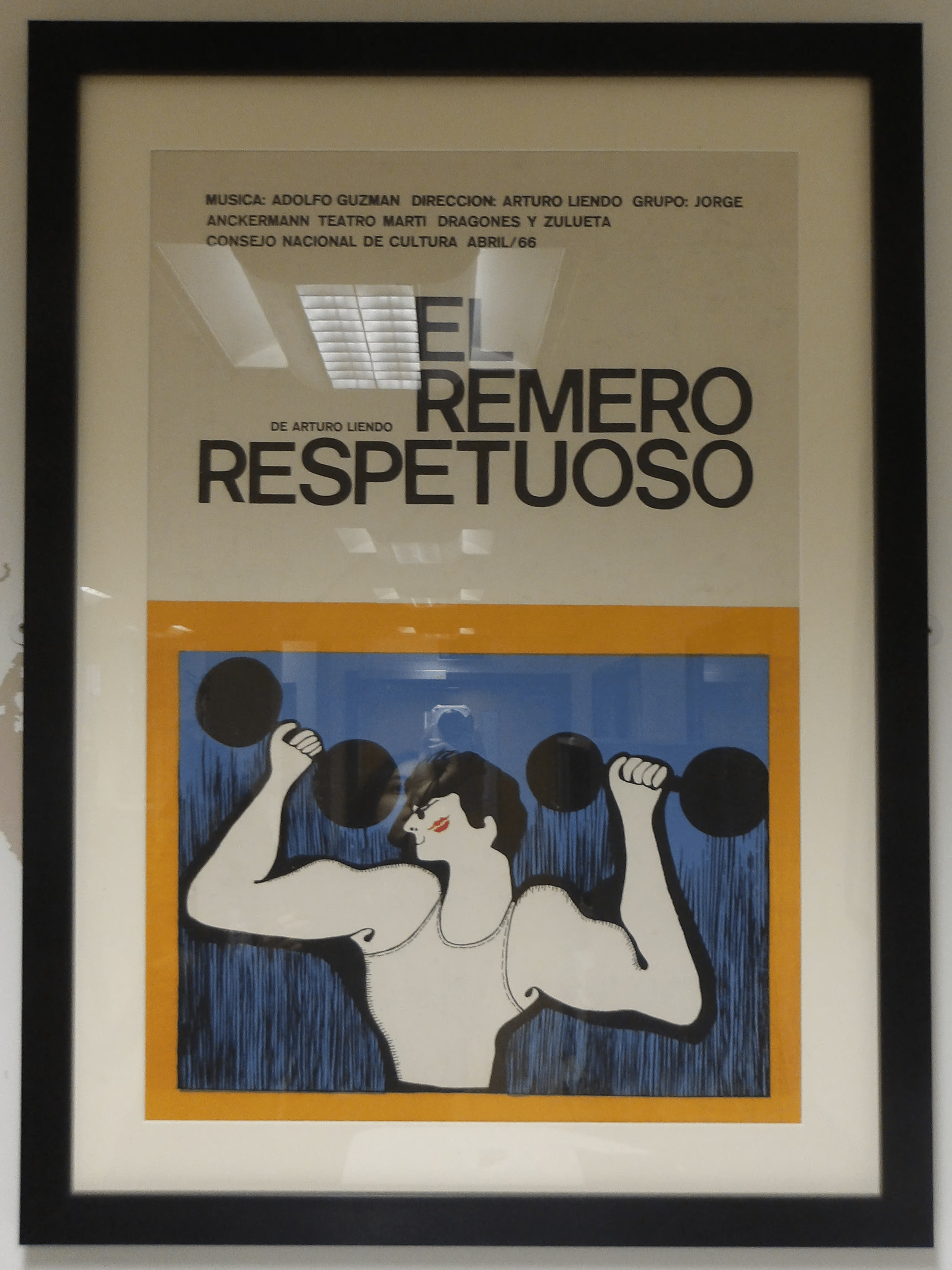
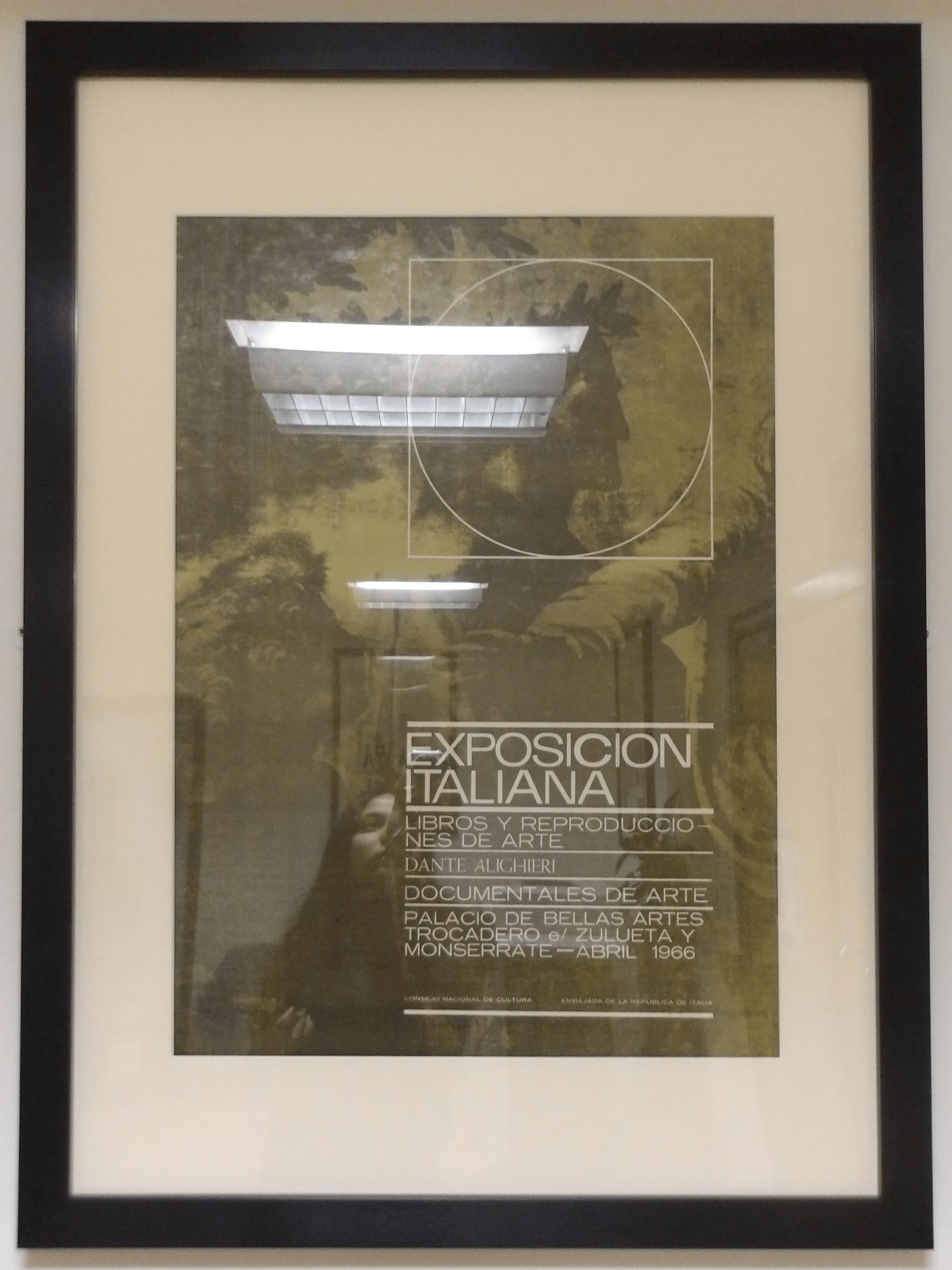
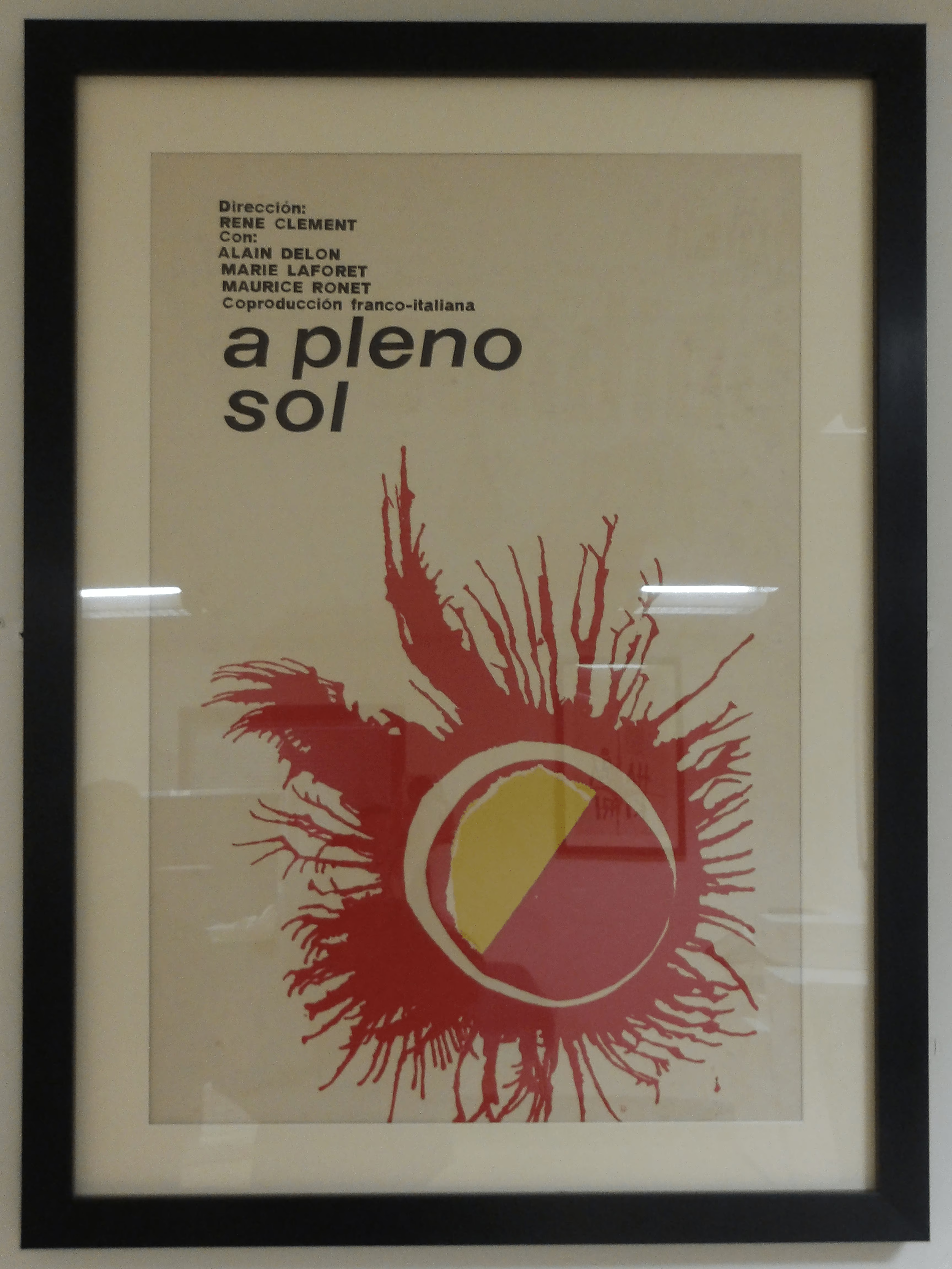
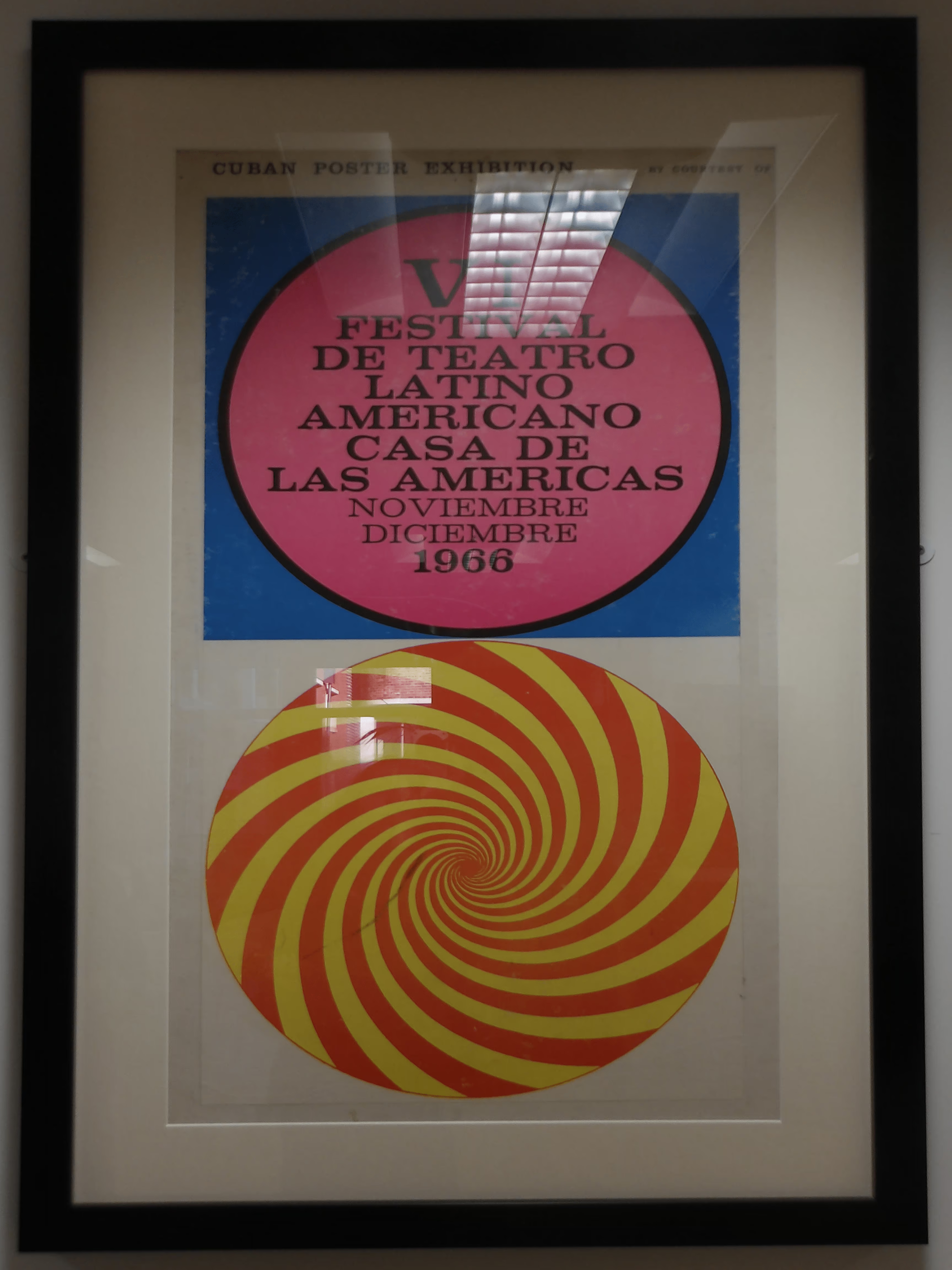
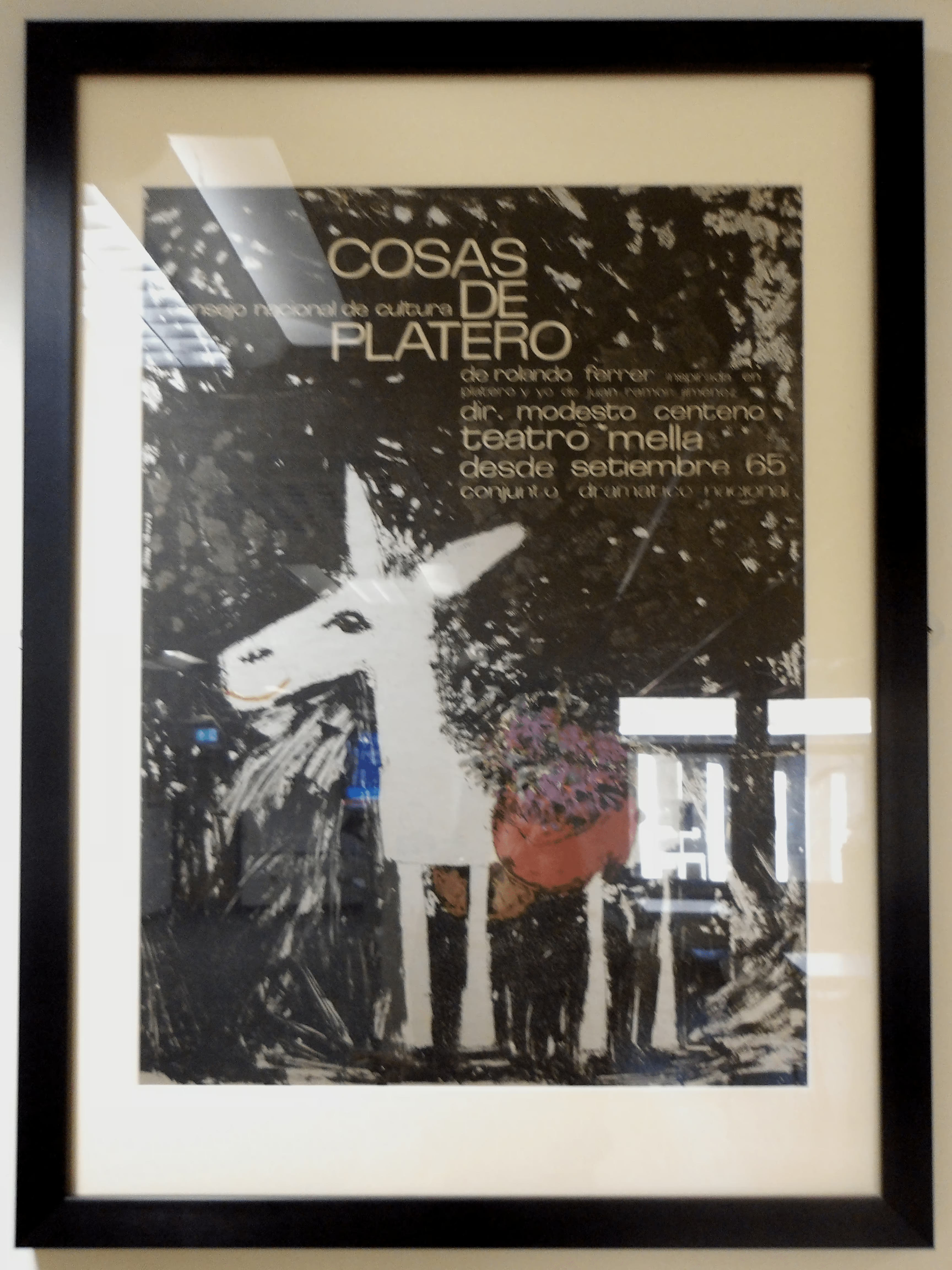
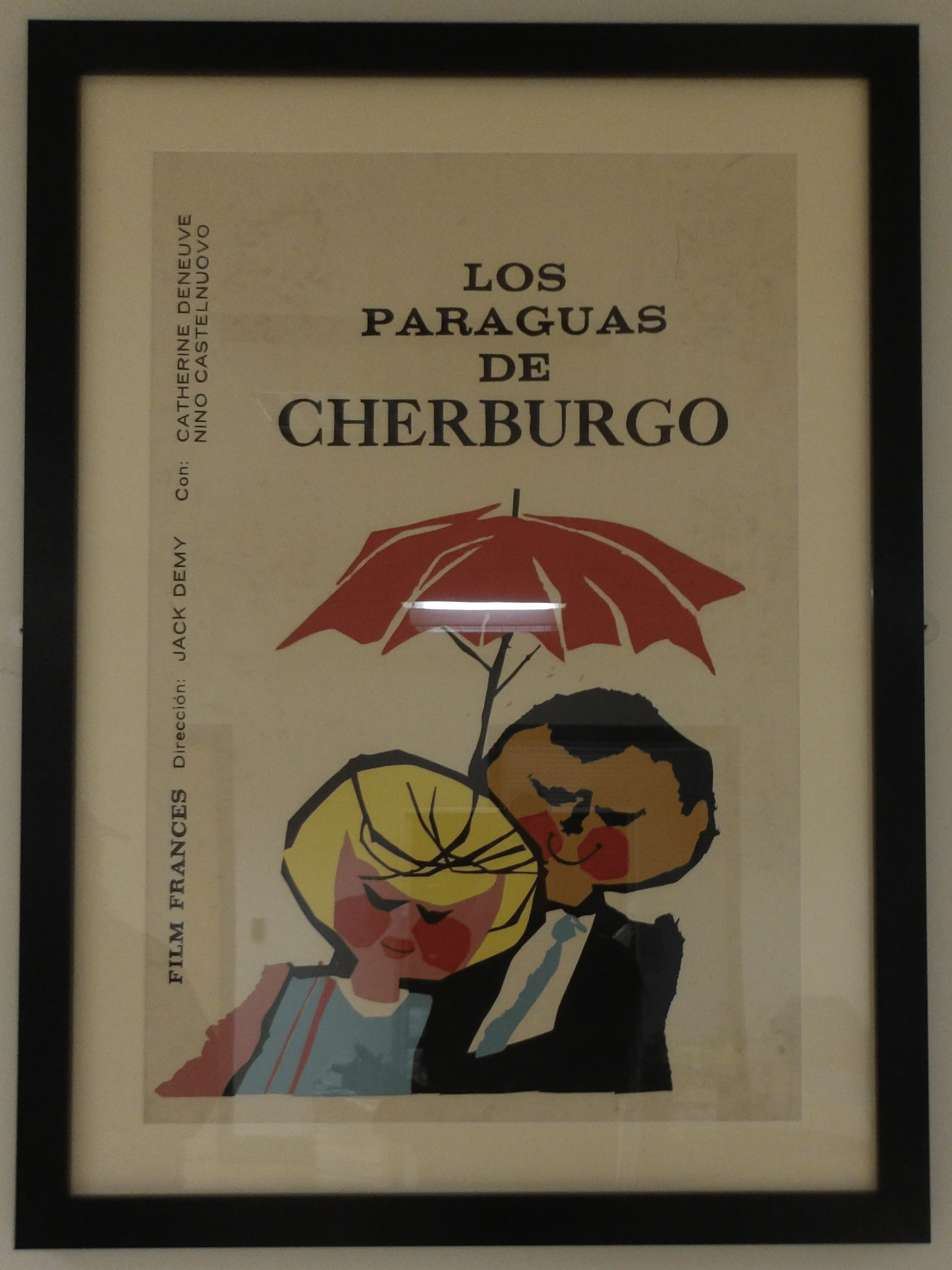
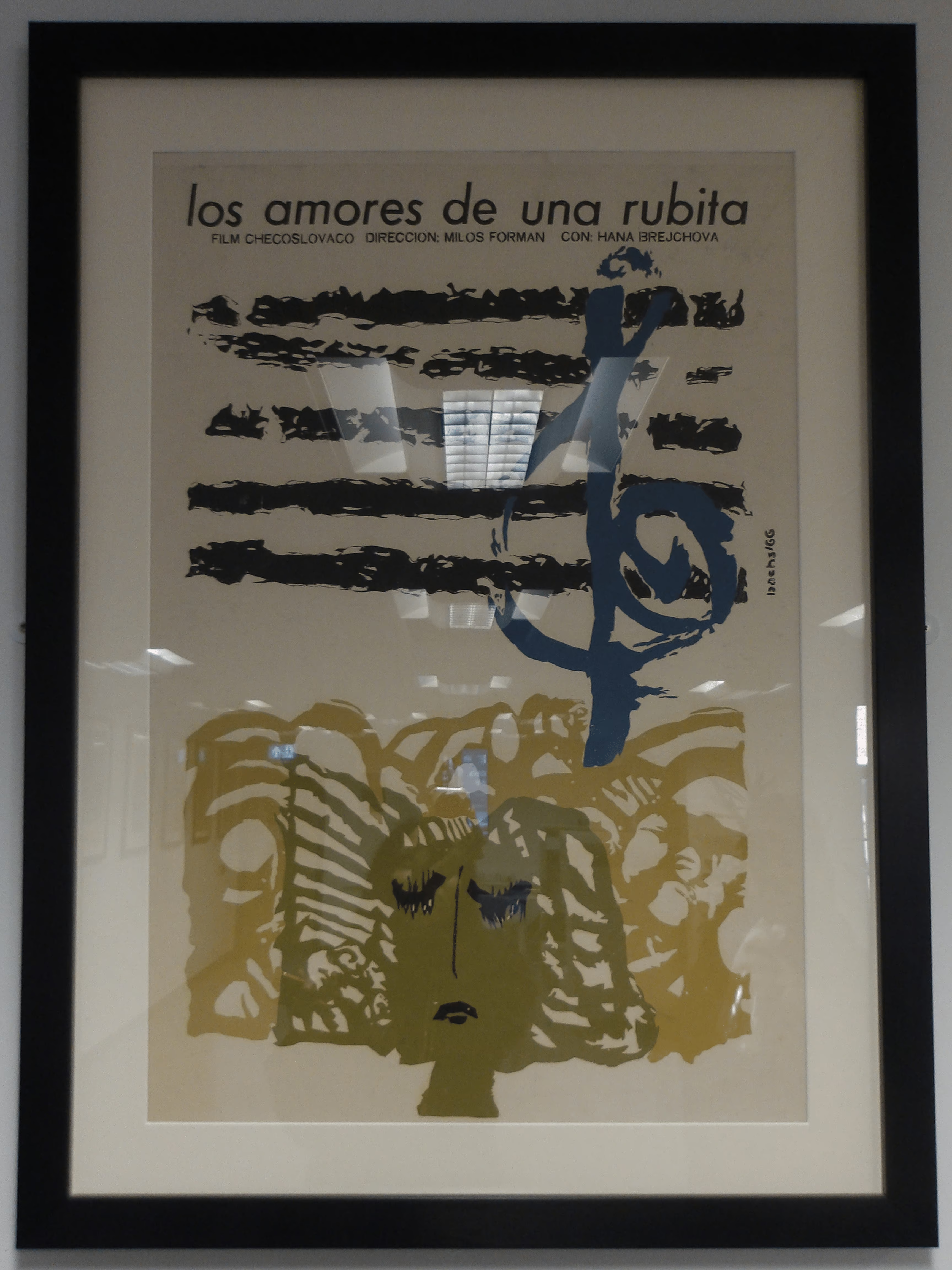
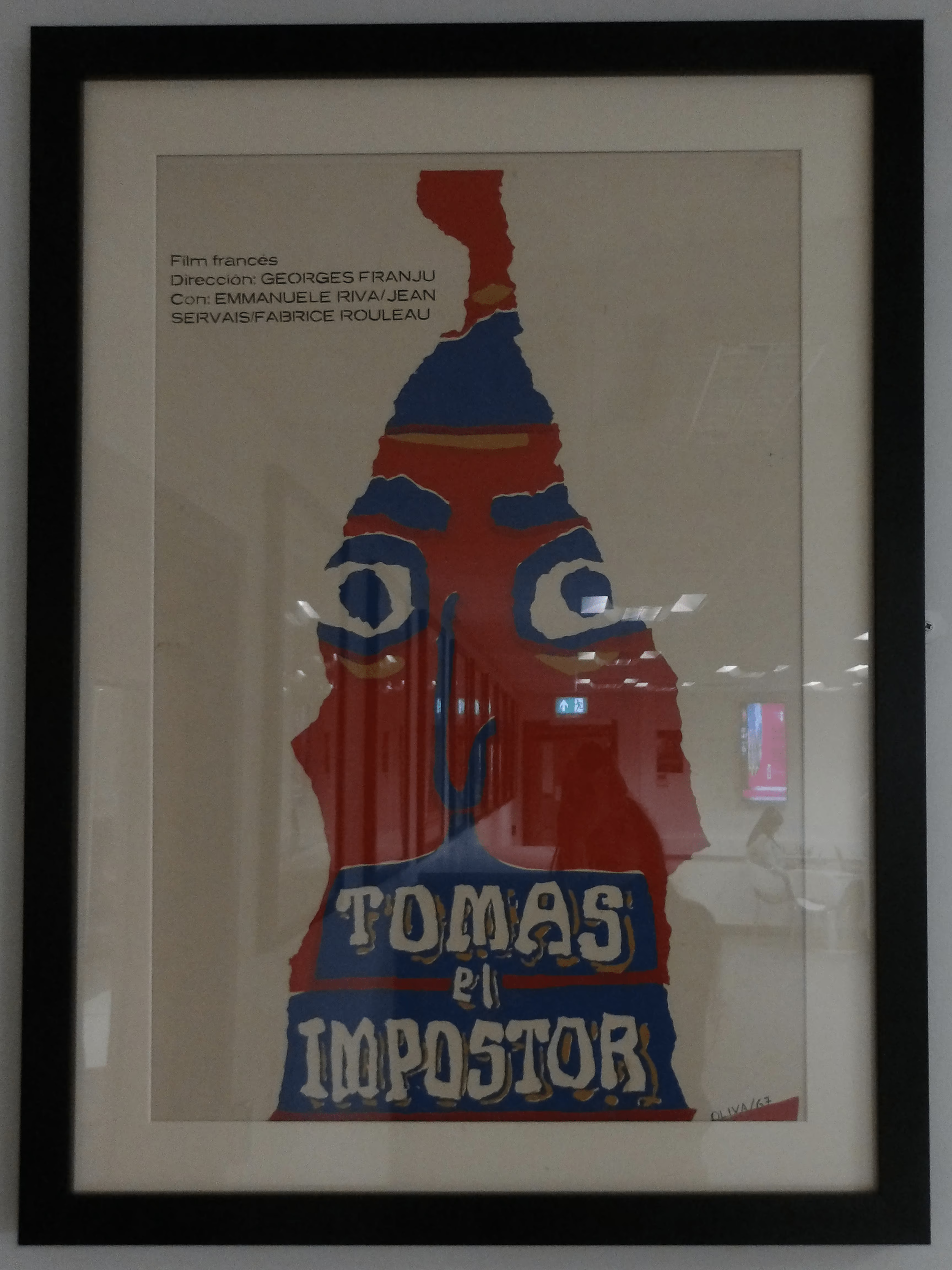
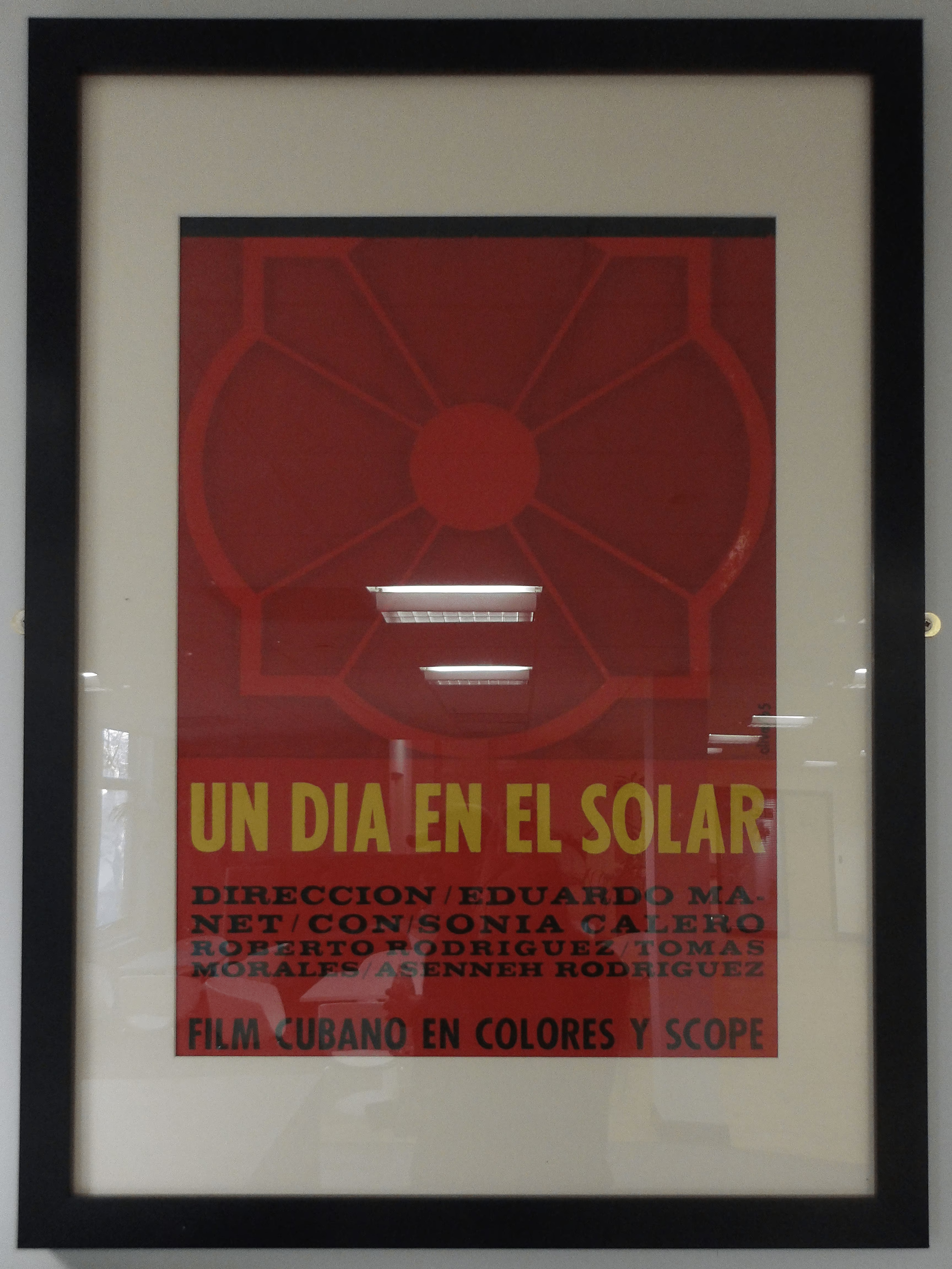
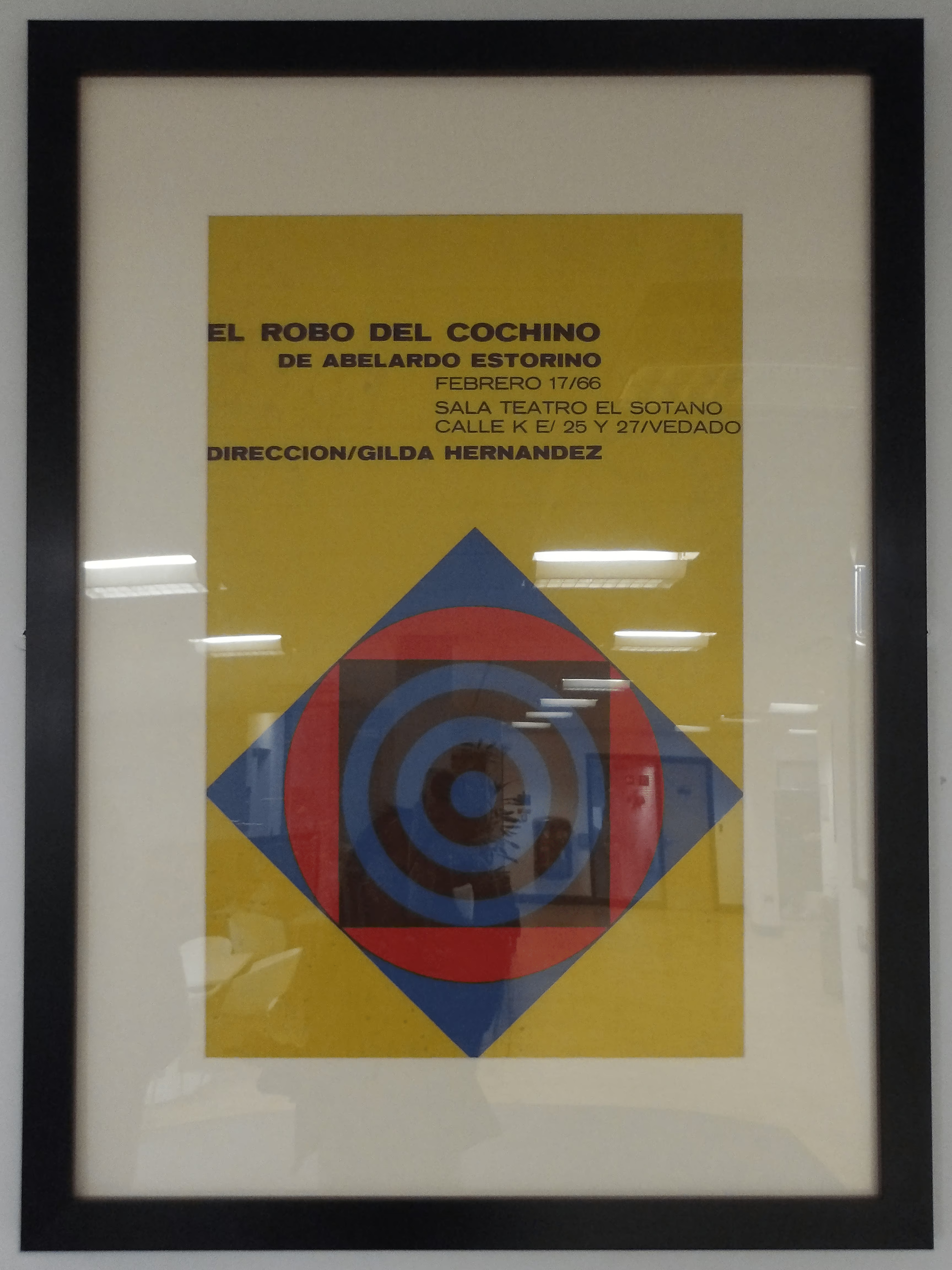
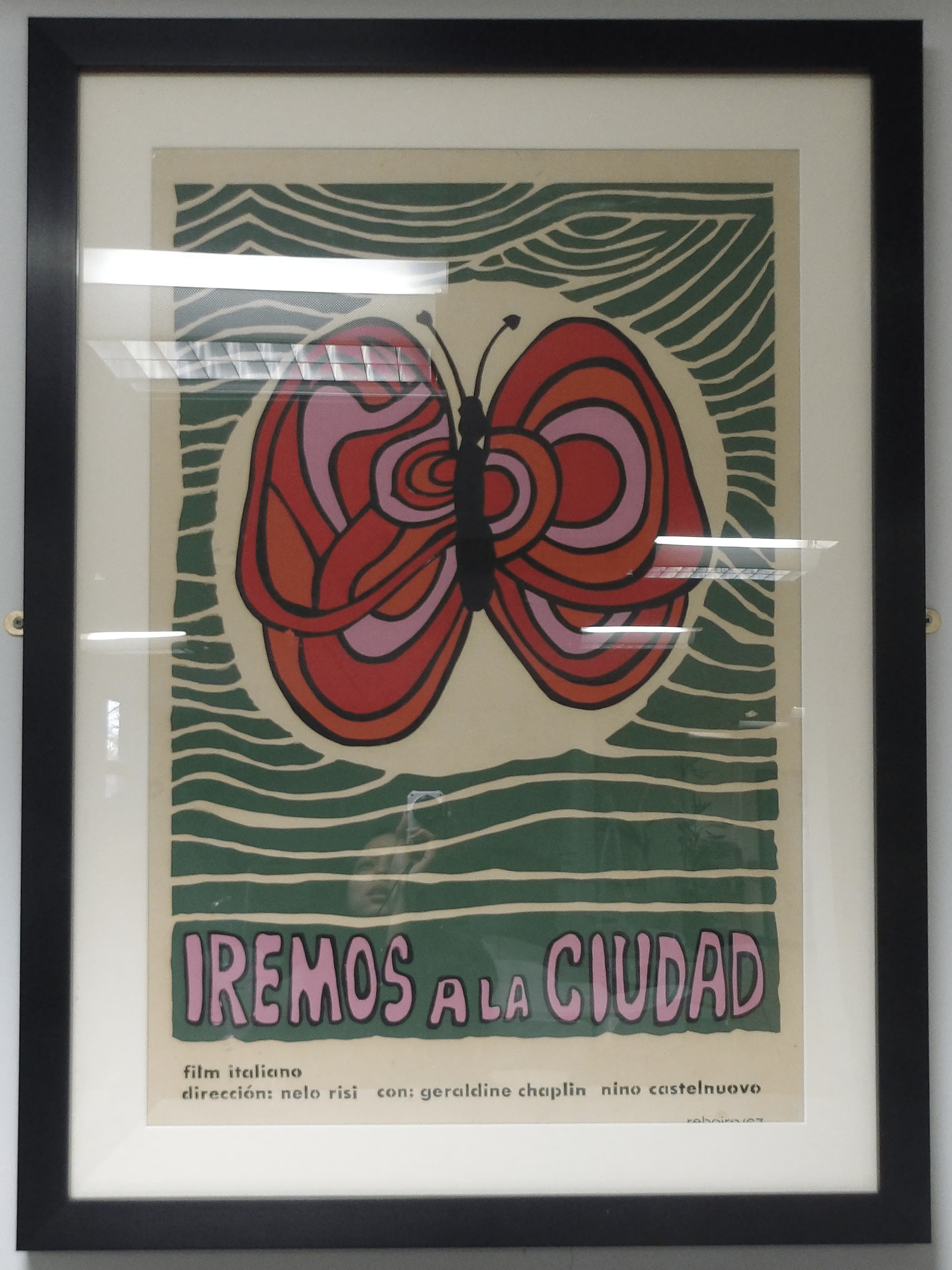
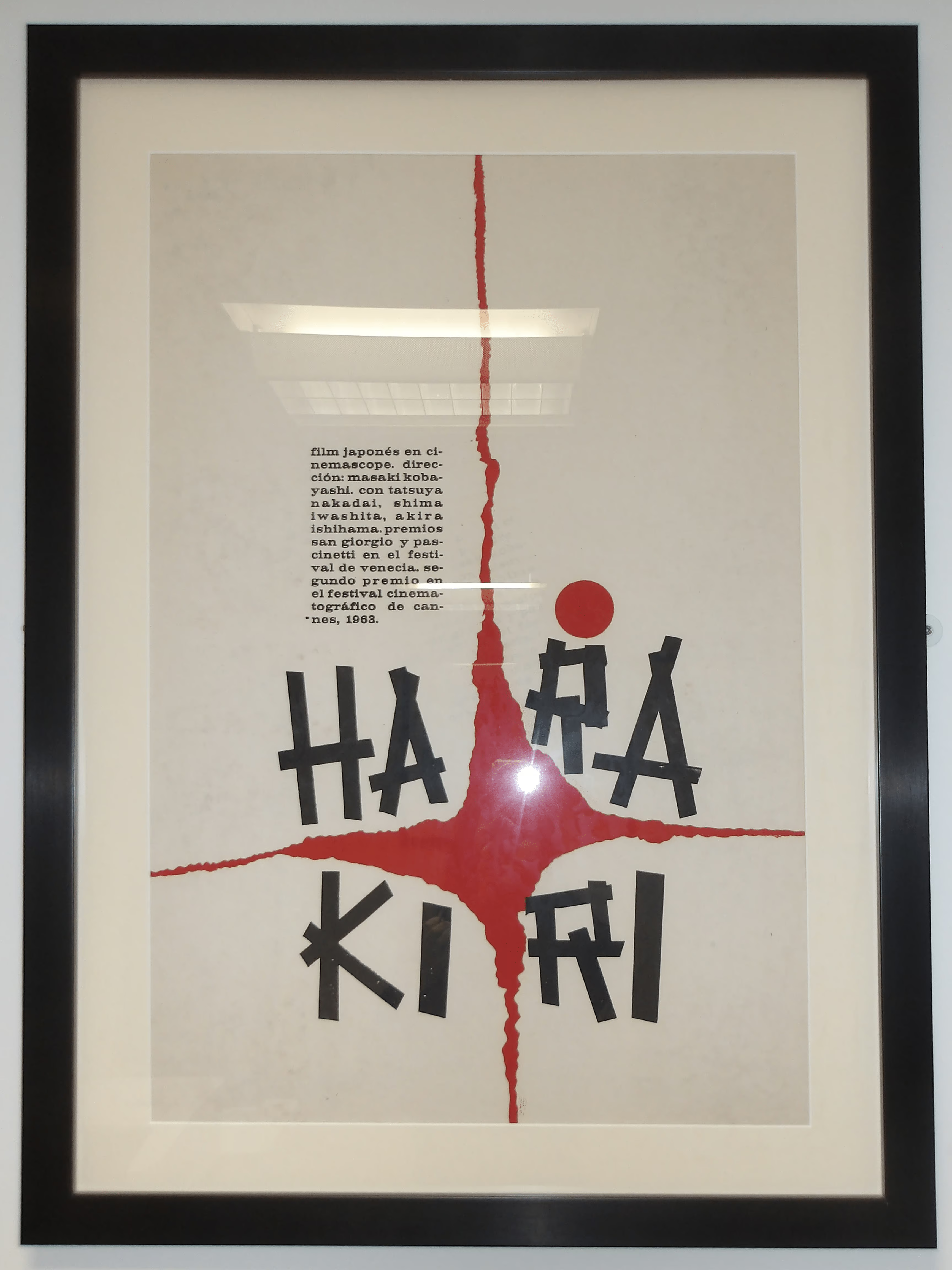
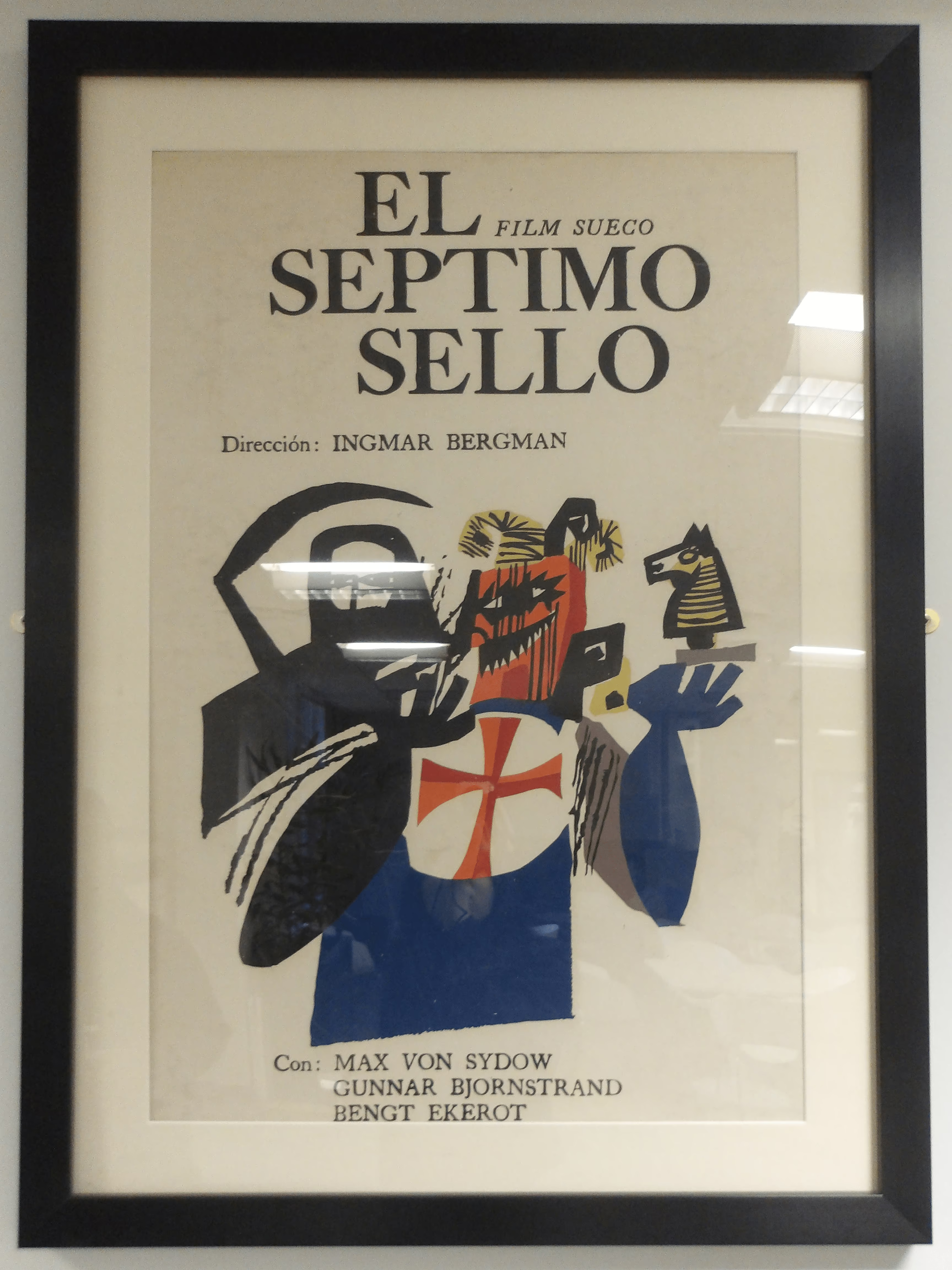
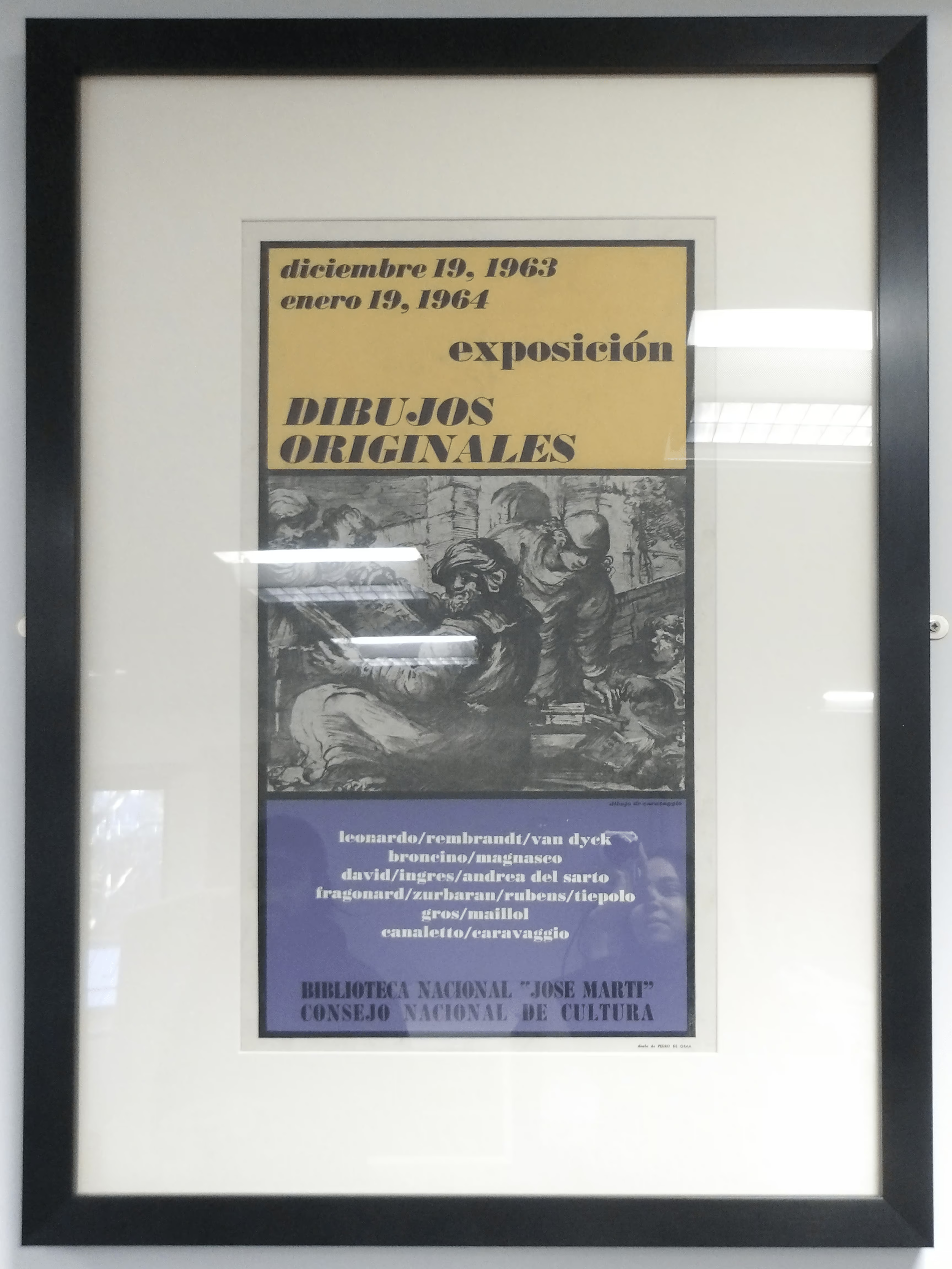
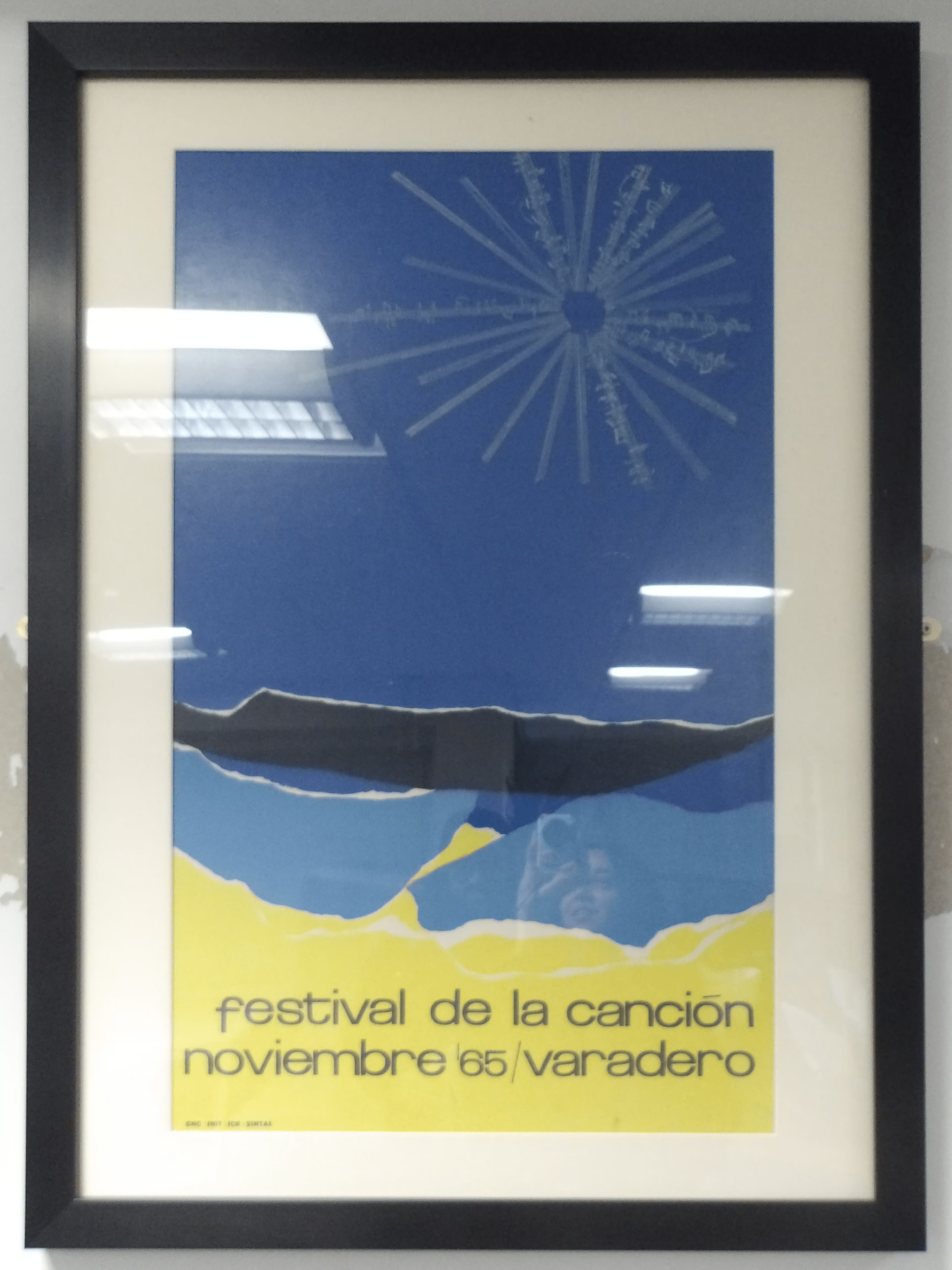
Our lecture on Cuban Poster Art and the Global Protest aided me in identifying prime sources, such as the UCLA International Digital Ephemera Project's Cuban Ephemera collection. Isabel also lent me a book of OSPAAAL posters called Designed in Cuba: Cold War Graphics for inspiration, and pointed me towards some original prints of Cuban film posters in Dryden.

The Harakiri poster, attributed to Antonio Fernández Reboiro (1968) for the Cuban Film Institute, was especially striking in person. It follows the OSPAAAL logic of visual minimalism and layered symbolism, a rising sun motif evoking Japan’s flag pierced by a sword, symbolizing ritual suicide (seppuku). The flat, high-contrast colours and clean geometry are a hallmark of the Cuban poster movement's fusion of Pop Art, Constructivism, and revolutionary idealism. The imagery becomes more than mere film promotion, functioning as a political statement on institutional violence, honour, and authoritarianism.
Offset lithography and silkscreen printing, the primary methods used for creating the posters, were impossible for me as I lacked the facilities, but I still sought to emulate the tactile quality digitally. By incorporating texture overlays and experimenting with blending modes, I would fake the subtle imperfections and graininess that give the works their distinct handmade authenticity.

I assembled a quick moodboard of some influential artists and posters that resonated with me visually and conceptually. Rostgaard stood out, particularly his Folding Nixon poster which famously transforms Richard Nixon’s portrait into a grotesque caricature when folded. He sports fangs and pointed ears, turning him into a vampiric monster, the physical transformation serving as a visual metaphor for political duplicity. Nixon’s "two faces" become both literal and metaphorical.

This moodboard I created to gather visual references that could inform my designs. I wanted something all-encompassing, globalist and inclusive of Latin America, Asia, and Africa, reflecting the inernationalist ethos at the heart of OSPAAAL. This feels particularly relevant today, as the major humanitarian crises and apartheid crises are occuring beyond Cuba's borders. Rostgaard captured the spirit powerfully in his anniversary posters, often depicting diverse peoples united in a shared struggle.
At the same time I wanted to remain attentive to Cuban symbolism itself. As noted in Designed in Cuba, "The art of the Revolution will be internationalist at the same time as it will be tightly bound to national roots". Isabel mentioned the University of Havana (venue of the anniversary event) staircase was somewhat an iconic landmark, emblematic of Cuban intellectual and revolutionary life. I also considered the Cuban flag, with its Lone star (La Estrella Solitaria). It predates the revolution, symbolising independence, with original intent potentially linking Cuba to the U.S., but the Communist government kept the flag, with the star now representing the free, sovereign Cuban state. The red triangle inspired by the French Revolution stands for liberty, and most importantly, the blood of patriots.

While developing thumnbail sketches I leant heavily on the revolutionary symbols I had researched. I produced several iterations using photos for reference of figures like José Martí and the University of Havana, labelling them to exclude weaker concepts. My intital idea was to depict Latin America, Africa, and Asia as overlapping continental outlines like interlocking pieces of a jigsaw, representing tricontinental unity. But Asia's vast scale made this composition visually cluttered, and the concept felt unintentionally exclusionary. Although the Tricontinental Conference centered on the Global South, omitting regions like Eastern Europe, which are now deeply affected by conflicts such as Russia and Ukraine, no longer felt representative of today’s interconnected struggles.

Thumbnailing proved invaluable in developing ideas. One concept I particularly liked was using the shape of Cuba as a woman's ponytail, a visual metaphor inspired by the Tricontinental Conference Anniversary website's emphasis on questions to do with anti-imperialist networks of women and indigenous peoples in the Global South.
A concept I was excited to try drew from Helena Serrano's Day of the Heroic Guerilla, the iconic poster featuring Che Guevara's portrait superimposed over the map of South America. Rather than replicating Che's image I aimed to feature the University of Havana instead, gradually zooming out into a map of Cuba. My goal was to reference the original respectfully without appearing derivative, attempting instead to honour it through thoughtful execution and reinterpretation.
Final Outcomes


In the end I produced eight seperate designs, each with variations, partly for experimentation partly because I'm indecisive. The process was a steep learning curve, I used Adobe Illustrator properly for the first time as I wanted to create clean vector graphics to emulate the streamlined style of OSPAAAL posters. It was a struggle for someone more accustomed to working loosely and intuitively on expressive digital paintings.
The UI took some adjustment, its nested layer system felt unintuitive compared to Photoshop or CSP that has traditional folders. Though trial and error I picked up several valuable skills and shortcuts. I expected to agonise creating smooth silhouettes, but discovered an efficient workflow: sketching roughs in my preferred art softwareb, importing them into Illustrator, then using Image Trace to convert raster sketches into vector forms. Once expanded these vecctors could be easily refined in colour and shape, achieving the crisp aesthetic I was aiming for.
Most of the post-processing was done in Clip Studio Paint, whixh supports vector art. I created the template for the back-side postcard lines and message there, replicating the layout across each design.
The text reads:
60 AÑOS DE LA CONFERENCIA TRICONTINENTAL
60 ANS DE LA CONFÉRENCE TRICONTINENTALE
60 YEARS OF THE TRICONTINENTAL CONFERENCE
الذكرى الستون لمؤتمر القارات الثلاث
I triple-checked the translations with AI to ensure grammatical and tonal accuracy. Including Spanish, French, Arabic, and English was essential as OSPAAAL standardised its posters to include these four key geopolitical languages of the Global South and of international diplomacy. Multilingual text wasn’t decorative but a political necessity, a universal manifesto, rejecting Eurocentrism by uniting multiple linguistic traditions under one message: one struggle, many voices.
Several of my designs reference specific OSPAAAL works. Design No.5 pays homage to Rostgaard's 1969 Che Guevara poster, while No.7 draws on his recurring personifications of Latin America, Africa, and Asia. I reinterpreted these figures as women rather than men, responding to the historical underrepresentation of women even within progressive revolutionary movements, and aligning the work with the conference’s renewed feminist focus.
The Reception

(Awaiting the printing of whichever designs end up being chosen)


Comments